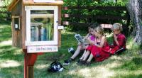
Pocket Park 2015
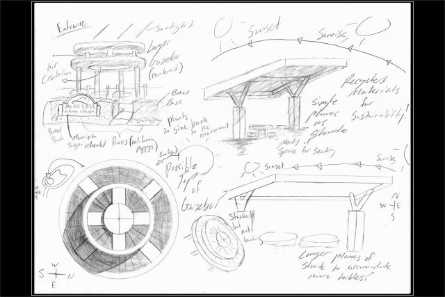
I've drawn some structures I may incorporate into my final design. Inspired by the modern design my high school has adopted, these visually intriguing sources of shade not only adequately protect visitors from too much exposure from the sun, but also fit nicely with the surrounding environment, "Murrieta Oaks" to be precise. In graphic design, I've learned about the main principals of design, with unity being one of them. Unity is a principal relating to the wholesomeness of an image, whether everything appears to belong and is aligned in a logical manner. When a design has too much unity, it may become boring to the viewer. To counter the potentially redundant disciplines of unity, the designer may need to instill yet another principal, variety. Variety is almost always successful in its attempt to keep an image active and interesting. The focal points associated with variety is what undermines the boring qualities of a overly unified design. All of the housing in "Murrieta Oaks" follow an arbitrary routine of design, thus resulting in a very aesthetically unified environment. By introducing a modern perspective concerning my park, I am providing variety that is deliberately trying to positively separate itself from the community. This dissociation is what will help make my park distinct from others.