
Hill Range Park
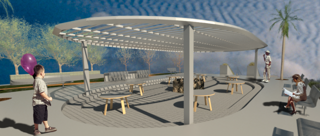
This final picture is one of the most detailed. It shows excatly what is happening on top of the hill. The reason i choose to make it like this was to give it a old 90s hang out feel. I want this place to be somewhere where people want to go and relax and talk to friends and be their selfs. It isnt too complex and it has plenty of sitting room for any one. Also, because it is on a higher elevation than the rest of the par, it gives the feel of being on top of the world.


Comments
I really like how your structure came out, it really does provide a cool place to hangout. People don't go outside often and this can be used to encourage that.
It looks really nice but maybe you should add some chairs with the tables. And the guy in the back might be a little bit too tall for the pergola. I don't like how the shaded area is indented into the ground because in the end it just makes it harder for disabled/people in wheelchairs to get into the area.
You could possibly fill the gaps in the pergola with glass in order to provide rain shelter, but other than that I really like the shape of it. I also agree with GGCuba's comment because with the element of universal design being prominent in architecture today, I also believe that there should be equal access to users of all abilities, and stairs aren't very wheelchair-friendly. Despite these small flaws, this is a great element in your park and I like how it serves as the focal point, as it is a major part of your facade.
I like the use of different levels it makes the park feel more open and gives parents a place to sit and watch there kids play.
The shading in your design is very unique in terms of design and creativity. The theme is also very specified and the hill plus the sign is very pleasant. The park is an overall success as to what you wanted to achieve. I hope you can bring this same level of professionalism next year.