2013 national competition project | Library Redesign #160

05/14/13
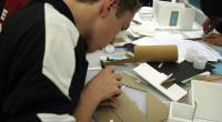
Floor plan of the final design. I had to make some compromises to the original plan in order to make my ideas work. In order to accommodate more seating options, I had to reduce the capacity for through traffic. I decided that through traffic in the library wasn't a big issue, and theorized that if people had to walk past tables to exit the library, they would be more likely to see friends or remember that they needed to do work and settle down. Thus, the new layout helps draw people in more effectively.
I reduced office and staff space to keep librarians out and amongst the students. Bookcases have been condensed and removed from the central area. The entire library is organized based on observed traffic patterns, lighting, noise levels, and atmosphere. It incorporates features that will keep the media center modern and flexible, such as a distance learning classroom, laptop/tablet capability, and multipurpose classroom. This design can give the East media center, which has not seen major renovation since its construction in the 1960s, a much-needed improvement in efficiency and aesthetic quality.
This Step

What should I upload in this Final Design step?
Consider uploading final hand or digital renderings, images of your finished physical model, or your finished digital model (as a DWF file).


Comments
Great layout. Wonderful circulation pattern from the entry to the librarian station. Clear zones throughout the library for various functions. The stacks being located in the rear is a good choice allowing for the tall stacks not to block views within the library. The visual control to all of the computer stations works well. And the private functions are tucked away in the corners of the space so they do not impede the openness of the plan.